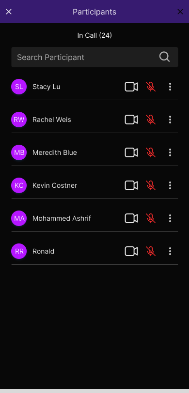
Design System
A design system is a collection of reusable components, defined by clear standards, that can be assembled together to build any number of applications.
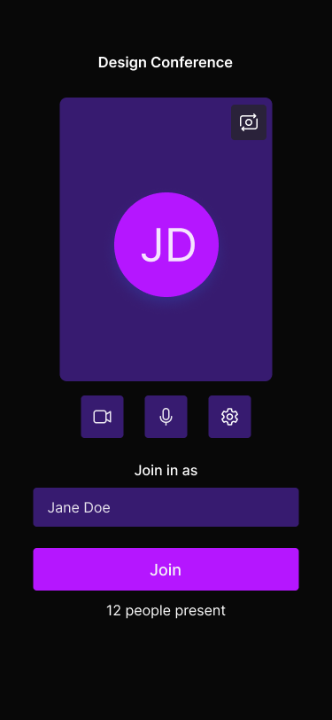
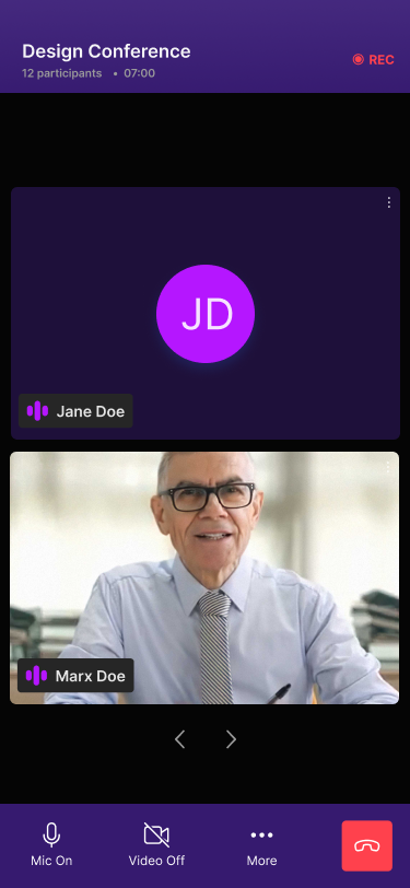
Dyte's UI kit uses the Atomic design principle, which logically organizes screens for various devices, making it a versatile system. Design tokens are used in Dyte's UI Kit to maintain a consistent look across platforms. By combining design tokens and Atomic design principles, Dyte ensures a smooth and adaptable user interface experience on different platforms.
Design Tokens
Design tokens are the single source of truth to name and store design decisions.They are values that help keep the design consistent and flexible. These values include things like font styles, spacing, colors, borders, and more, allowing you to easily customize the overall look and feel of a system.
In the Flutter UI kit, design tokens are shared and managed using themes. Themes in Flutter use the ThemeData class to store and propagate design properties, such as colors, fonts, and more, throughout the widget tree.
Let's understand how you can customize your UI with Dyte's Flutter UI Kit using design tokens.
Customize themes with design tokens
Dyte offers the DyteDesignToken class to customize the theme of the UI kit. Pass the DyteDesignToken object within the DyteUIKitInfo object to customize the theme.
With DyteDesignToken, you can customize the following design properties:
backgroundColor:The background color of the UI Kit.textOnBackground: The text color on the background of the UI Kit.backgroundColorSwatch: The background color swatch of the UI Kit.brandColor: The primary color of the UI Kit.textOnBrand: The text color on the brand color of the UI Kit.brandColorSwatch: The brand color swatch of the UI Kit.danger: The danger color of the UI Kit.success: The success color of the UI Kit.warning: The warning color of the UI Kit.
You have two options to customize the UI Kit's theme:
Pass a single color.
You can pass a single color to the backgroundColor, brandColor parameters. Or you can use a combination of backgroundColorSwatch and brandColor to customize the theme.
Use a color swatch.
For the brand color swatch, make sure it contains 5 entries with keys 300, 400, 500, 600, and 700. For the background color swatch, provide 5 entries with keys 600, 700, 800, 900, and 1000.
To achieve this, utilize the DyteColorSwatch class with two parameters: the default color key and a map of colors.
final primarySwatch = DyteColorSwatch(
    500,
    {
      300: Colors.blue.shade300,
      400: Colors.blue.shade400,
      500: Colors.blue.shade500,
      600: Colors.blue.shade600,
      700: Colors.blue.shade700,
    },
  );
Customize borders with configuration
To customize the border radius and border width of the UI Kit, you can use the DyteBorderRadius and DyteBorderWidth enum values in the design token.
Here are the available DyteBorderRadius values:
| Token Name | values |
|---|---|
DyteBorderRadius | sharp, rounded, extraRounded, circular |
Here are the available DyteBorderWidth values:
| Token Name | values |
|---|---|
DyteBorderWidth | none, thin, fat |
Example
Here's an example of how you can customize the Flutter UI Kit using the design token:
final uikitInfo = DyteUIKitInfo(meetingInfo,
    designToken: DyteDesignToken(
      colorToken: DyteColorToken(
          borderRadius: DyteBorderRadius.circular,
          borderWidth: DyteBorderWidth.fat,
          backgroundColor: Colors.black,
          textOnBrand: Colors.white,
          textOnBackground: Colors.white,
          danger: Colors.red,
          success: Colors.green,
          warning: Colors.yellow,
          brandColorSwatch: DyteColorSwatch(
            500,
            {
              300: Colors.blue.shade300,
              400: Colors.blue.shade400,
              500: Colors.blue.shade500,
              600: Colors.blue.shade600,
              700: Colors.blue.shade700,
            },
          )),
    ));